

How to Create a Cinematic Contrast
Before knowing how to create contrast, you must understand - what is Cinematic Contrast?
As a filmmaker, you must’ve seen countless movies and tv shows. Each with their own unique contrast based on film stock and overall direction of how they wanted them to look.
The answer to what is Cinematic Contrast is simple…
It is what you make of it. There is no real right answer. But contrast should complement the story, not distract you from it.
In this example I am about to break down, I will show you how to achieve a contrast that was built for the 1999 groundbreaking film, The Matrix.
The Matrix was shot on both Panavision and Arriflex with a Vision 200T film stock and 35mm format.

Shot of Morpheus’ interrogation scene.
Based on this still frame of the film, we can see a distinct color palette with a relatively soft contrast. Our shadows are lifted while still providing depth in our frame.
So let’s break it down!
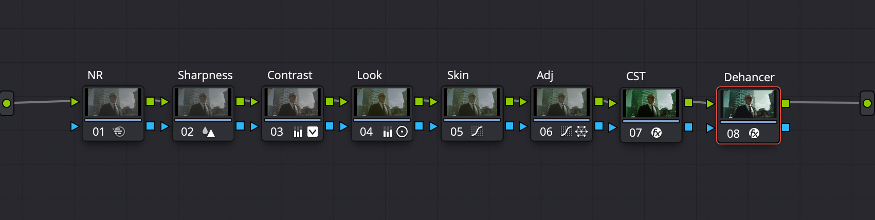
Node Tree

Shot on Arri Amira
Step One: Convert to Color Space
I uses Davinci Resolve’s CST (Color Space Transform) to convert the footage to how it looked on set so I knew what I was working with.

Rec 709 Color Space
Step Two: Set to Monochrome
In the timeline node tree set up, I created a monochrome node so the footage is in black and white.

Monochrome
Step Three: Create the contrast
In the normal Node Tree, I went into my contrast node and created a custom S-Curve, where the shadows were lifted will still creating that subtle 90’s contrast. The S-Curve will vary depending on your footage.
I let my footage stay in monochrome for this portion of the grade because I wanna set an accurate contrast that color doesn’t get in the way of. It helps me personally see the black points and highlight details a lot easier.
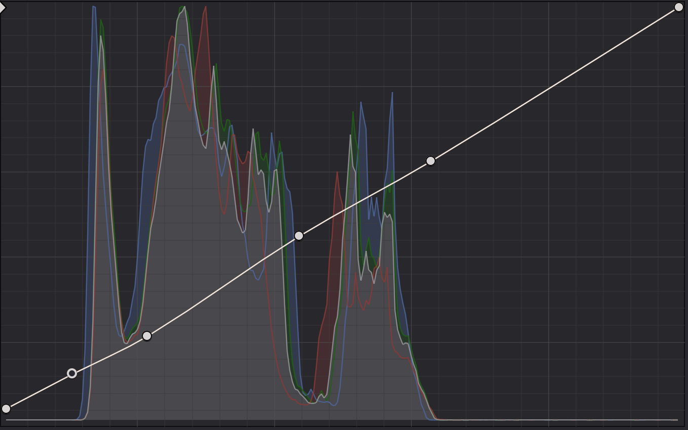
Custom Curve
Step Four: The Look
To create an authentic Matrix look, I used Lift/Gamma/Gain, HSL Curves, and HSV Color Warper along with the 3rd party plug-in, Dehancer.
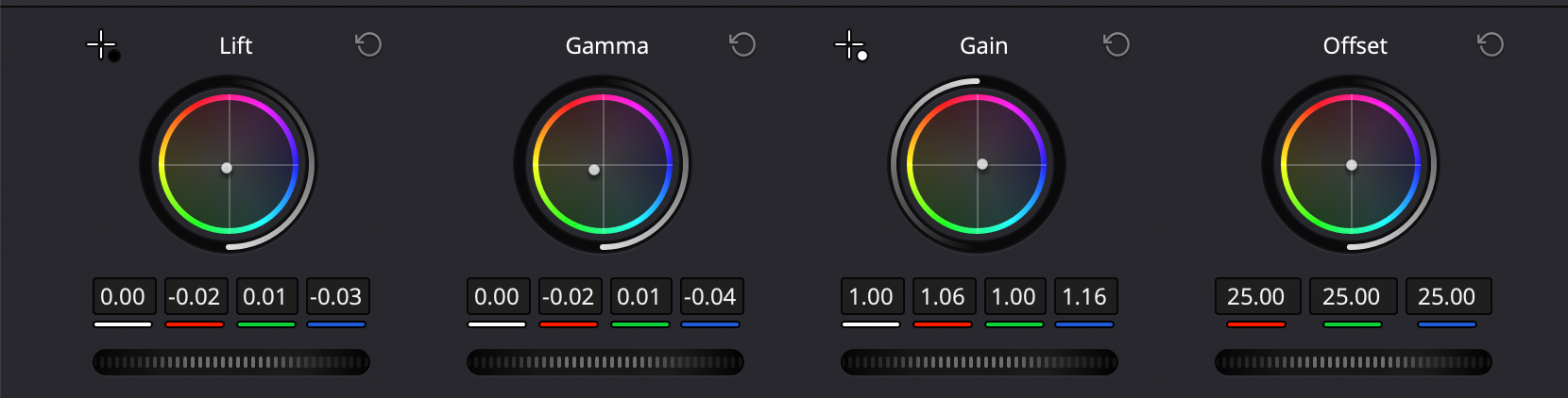
Primaries
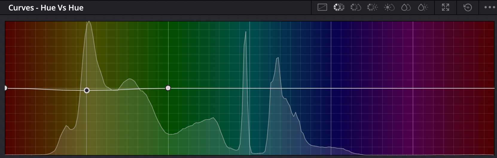
Hue vs Hue
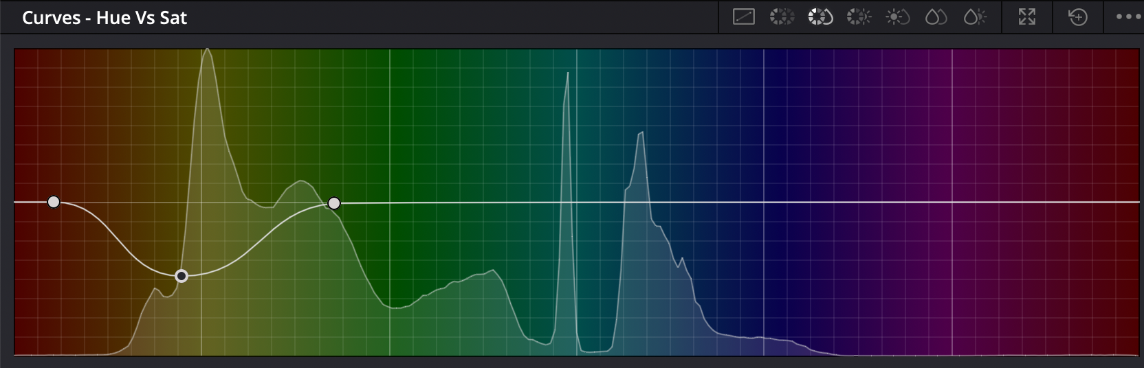
Hue vs Sat

Color Warper

Dehancer Settings (1/3)
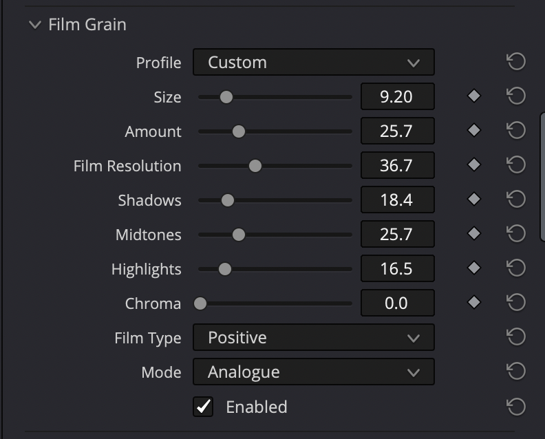
(2/3)

(3/3)

Final Grade